Rebecca Douglas 8052
Chloe Kwok 8115
Abbie Morris 8155
Georgia Moore 8154
Showing posts with label Credits. Show all posts

Friday, 24 January 2014

Non Diegetic Sound for credits


 Here, I started to make the non diegetic sound, based on the practical that Rebecca did with the credits and the film clips.


  •  Firstly, I uploaded the video into logic pro so that I can edit to the video, for more effect, and since the bass sounds need to be in a specific place.


  •  Then, I marked out when the credits would appear, so I would know where the bass booms would go.


  •  I then added the drum sounds and some very low string notes, so that it would give it an eerie sound. 
  • I also automated the volume levels with the drums, so that it wasn't too loud, and that there would be some sort of crescendo to add some suspense.


  •  I wanted the drum to sound like a heartbeat in some places, so I needed it to echo.
  • So I used the space designer to add some reverb to the drum, and I ended up choosing the "echoing mountains" as the echo sounded very natural.


  •  I then EQed the drum so that the higher and lower frequencies were cut off, so that it would have a muffled, telephone effect.


  • I also used the pitch bender on the keyboard to pitch bend an extremely high pitch sound, which would happen periodically, which I need to fix up, when we have edited the final thing.
Here is the prototype finished:

Friday, 17 January 2014

Credits and Footage

Before, I designed the credits however they appeared on screen really fast, unlike credits in a Hollywood Movie. Therefore we decided as a group to test different ways of having the credits appearing on screen. Eventually we decided to have each credit appear after a section of footage. I took the footage that we shot on Sunday 12th January 2014. I edited the footage into my previously made credits and here is the final product (however we do need to add non-diegetic sound, that will be made during post production).


Monday, 6 January 2014

Practical: Credits

We needed to design our credits for our film opening. We decided to take influence from Mama's opening credits by using  the idea of children's drawings as a basis. 
I created this in Final Cut Pro by:

Uploading all the media into Final Cut Pro. I then dragged a specific image into the timeline. I hit "CROP" at the bottom of the view screen and then "KEN BURNS". This meant I was able to change the zooming point of the image.

This then brought up two boxes, "START" and "STOP". This shows us where on the image the film will begin and where it will end.


I then selected the blade tool and cut the clip to the length that I thought was suitable, allowing me to be given enough time to show the credits. 

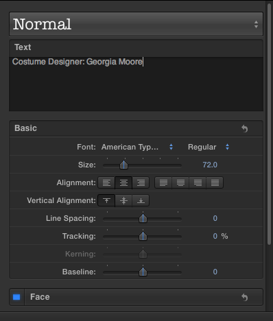
I then needed to add text. So I hit the text button and then chose the specific style of text that I wanted to use. 

Then I edited the text itself, meaning I could make the credits say whatever I wanted them too.


This allowed me to add transitions between the images and credits that appeared on screen. I added the "FADE TO COLOUR" effect in order to add an eerie effect. 

I repeated this for as many credits that I needed to show. Here is the finished product: 


Wednesday, 23 October 2013

Opening credits editing

This video was the original edit of the credits done by Rebecca


To do this I used bad TV effect over the drawings to make them flash more on the screen as they were very slow and gentle in the first edit which is not as in keeping with the horror theme. This also made the footage seem more tense and scarier, showing that something was about to happen
After doing this, i decided to change the font and the way the credits entered the screen. To do this i tried many different fonts but decided to use typewriter. This comes on to the screen one letter at a time so the slow pace creates tension and a sense of uneasiness.


Then i added the text on screen naming the different people involved and their jobs keeping the font quite small so that the images could be seen clearly. I stayed with the white colouring because i think it stands out best against the drawings. Also white doesn't give away too much, it leaves a sense of mystery and paired with the slow entrance of the text this can be more subtle and scary. 

This is the final edited version