I deconstructed the title credits of case 39 which started from 2:38 onwards.
The title of the film came surprisingly early in the film, and it doesn't make that big of an impact as it is a small font and it isn't any different from the other title credit's typography.
I wanted to practice some of the camera angles that we would use in our final project, and I wanted to practice putting in some title credits.
I used Final Cut Pro for the editing software, and I used my Nikon D3100 for the videoing.
These were the many videos that I took, so that I would be able to use for this piece. However, after watching them on the computer, some of them were out of focus or they just weren't smooth enough to put into. Many of these videos were of the same thing, so that I would have multiple videos to choose from and choose the best shot one.
After watching through the videos, I chose the clips that I liked best, and them i put them altogether, I tried to choose the shots that would make the most sense in a chronological order, and these shots were all done on an impulse, and I didn't have a storyboard.
For the editing, I used some straight cuts, and some cross dissolves, so that it would flow nicer. I used the straight cuts when I was switching angles when the girl was walking so that it seemed natural.
The purple blocks are the different layers of titles I put in. The reason I have so many is because I custom made a title credit so that it was unique and it would come out how I wanted it to come out. I also put cross fades at the end of each credit so that it wouldn't be disjointed.
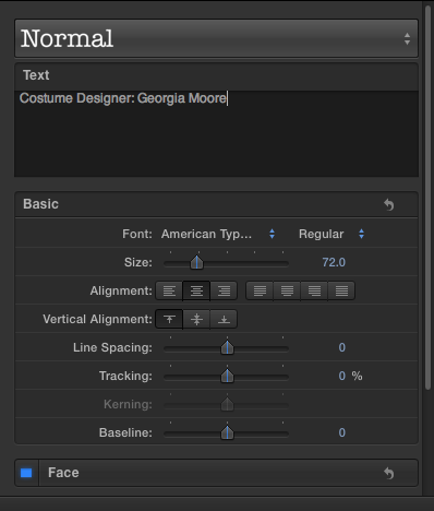
These were the parameters I used for creating the title credits. The most important thing I did was to lower the opacity to 0% so that when it faded in, it would not leave a grey marking behind. I also increased the blur, so that it didn't appear harsh when coming in, and the tracking was also adjusted a little bit larger and 9.67%.
For this shot, I decided to do a shot on the floor with the person walking towards the camera, and the credits to the left and the right. I wanted to practice changing the focus whilst she walked forwards, so that it was a smooth as possible. During the real thing, I would have to change the focus even more accurate as there were times where the focus was off.
Here I used an over the shoulder shot, and followed her as she walked, so this was to practice keeping the camera still whilst I was walking with her. I also realised, that when shooting these shots, the person would have to walk slower for us, but even thought she was walking slow, on camera she looked as if she was walking a normal speed. Even if it looked slow, we could've edited it to be faster in Final Cut.
Here is the finished product.
Overall, I thought that the video i made was pretty decent, but I could've definitely improved on the stability and the smoothness of the panning shots. If I had more time, I would've made this clip a little bit longer aswell.
When looking at trends in names of supernatural horrors I noticed that a lot of them are only one word long or two words, one being word being 'the.'
for example- the ring
The words are not always scary on their own and aren't associated with horrors or supernatural elements. However, this can make them more scary as they seem more mysterious and take something from everyday life and make it scary and haunted. The ring has no obvious link with scary films and so this is more surprising.
The word 'ring' is written in childish writing which links to the character of the child used.
The writing is white which is usually linked with calming peaceful things and so is not eye catching or scary looking, this makes it unconventional which at times can be even more usnettling.
The grudge
The writing here is much more conventional and expected of the horror genre, the red colour is synonomous with blood and danger and the scrathed, rough effect gives the dirty and unclean feel. The word 'grudge' suggests revenge and anger which again, makes it more clear that this is a horror film. Only two words are used here, which appears to be a convention in horror film names.
Mama
Here only one word is used which has no link to scary things at all, in fact it is linked with a mother who is the most comforting and close person to a child. This takes someone who is loved, protecting and close and turns them into the complete opposite. The typography is white allowing the word and the image to speak for itself, the simplicity also helps it to stand out more against the dark background image.
We have chosen 'porcelain' as the name for our film because it links with the use of china dolls and the way the possessed girls face is painted. It fits with conventions because alone it doesn't seem scary, but paired with the typography it adds mystery and tension as to what the film is about. As well as this, it is only one word and this simplicity fits into the genre well.
This video was the original edit of the credits done by Rebecca
To do this I used bad TV effect over the drawings to make them flash more on the screen as they were very slow and gentle in the first edit which is not as in keeping with the horror theme. This also made the footage seem more tense and scarier, showing that something was about to happen
After doing this, i decided to change the font and the way the credits entered the screen. To do this i tried many different fonts but decided to use typewriter. This comes on to the screen one letter at a time so the slow pace creates tension and a sense of uneasiness.
Then i added the text on screen naming the different people involved and their jobs keeping the font quite small so that the images could be seen clearly. I stayed with the white colouring because i think it stands out best against the drawings. Also white doesn't give away too much, it leaves a sense of mystery and paired with the slow entrance of the text this can be more subtle and scary.
For the opening titles we want the credits to be written on top of images of the scary drawings & demonic symbols, to make this scarier I played around with lighting to highlight aspects of the drawings
Typography:
The words that appear within this sequence are the opening credits. They show the production company and the actors/actresses who star in the film. The font the editing company uses is very different to the genre of the film. With a title like "Ghost Ship" you would expect the typography to very creepy and sinister however that isn't the case. The typography used in this opening sequence is pink and very feminine.
This could be to confuse the audience that perhaps the film isn't a horror as according to the title. Usually the text that is linked to supernatural horror films, is of a dark colour with a lot of detail. The typography used for this sequence is almost the opposite. It isn't dark, it's a pale bubbly pink colour and it isn't particularly detailed, it is simple with almost a hand written look to it.
Sound:
At first the music appears to be non-diegetic however, we later find out that it is in fact diegetic as the woman on the boat is singing along to the tune being played. The music is very contrapuntal to the scene on screen. The screen is dark and shot at night, or so it seems, where as the music is lively and up beat. Once the diegetic singing fades into a simple background music, you begin to hear people laughing and talking, as the crew welcome the guests, this is due to the fact there is now a large crowd on the screen.
As the scene continues, the woman who is singing, talks to her audience, demanding they dance. This causes the diegetic sound of russelling suits and dresses as the guests take to the dance floor. This is again followed by the diegetic singing of the woman. When there is a whole ship view, if you listen carefully, you can hear the breaking of waves as the ship passes through the water. This again is a diegetic sound as it is made on screen.
Shortly after, a crew member lifts a lever and starts a turbine. This is a diegetic sound that is almost like cranking something up. This causes the non-diegetic sound that is made when the camera moves quickly, following the rope that is attached to the turbine. This sound adds tension to the film putting the audience on the edge of their seat, awaiting, supposedly, something bad.
An low contrapuntal non-diegetic sound follows which also adds tension to the scene as it slowly gets louder and higher as the audience watches on. As the line snaps, creating a high pitching "ting" noise, pulling everything with it, it creates more suspense. When the line begins to get tighter, you can hear the diegetic sound of it slicing through people. This adds a gruesome effect to the scene and makes the audience cringe.
When the wire finally comes to halt, there is a diegetic sound of the wire vibrating. Although this may be a very quiet sound in real life, the volume is increased to add emphasis to the audience of the monstrosity that just occurred. The next sound is the diegetic creaking of the turbine that the wire is attached to. This shows the audience the possibility that the line could break again, causing more trauma.
The last sounds the audience here are both non diegetic and diegetic. The diegetic sounds being the victims whimpering and struggling to breathe. This adds a sense of slasher horror to the film and makes the audience want to look away. The non diegetic sounds that are featured towards the end of this clip are very low and loud in comparison to the diegetic whimpering sounds. This is to add "salt to the wound" and make the truma seem even worse, if possible.
This is an example of typography from 'Paranormal Activity' which is a supernatural horror about ghosts in the home. The film is largely shot using a home video camera and that is represented in the blurry affect on the text. The use of a home video camera makes the audience feel the footage has actually happened and is therefore more realistic created a scarier effect, this would be a good idea for our film and so the typography should represent this.
This text is in a red font which has connotations of anger and danger and so is very appropriate for the film content. Also, blood is red and so the font shows the injuries and gruesome footage that the video may show.
Another supernatural horror is 'insidious' again about a demon in the home however the typography is very different. In this example the typography offers less information about the film, it looks less scary and does not use the classic red or black colours. However, this contrast can be more scary as it shows the film has something else to offer, it is different and this can be more unsettling. The use of the white colour is very eye catching and will draw the viewers attention in straight away which is necessary to engage them and make them want to know more. The font is blurred and has a rough effect on it to show the destruction and to act as a contrast between the typography and the idillic family home in the background.
The film 'sinister' uses typography that fits more into the expected conventions of typography for a horror. For example, the way the writing looks as though it has been written on the wall in blood creates the feel that death is imminent in the film. Also, the letters themselves look as though they are dripping and oozing which creates connotations of dirt and blood like the words have been thrown up onto the wall and are actually a part of the scene. Finally, the use of the colour black creates a feeling of doom and darkness and tells the audience exactly what this film is about.
Overall, I believe it would be good to make typography that looks like it is a part of the scene like done in sinister because it makes the audience focus on the whole shot and draws their attention to the action as well as the films titles. I think the correct use of colour is important and therefore using a shade that suggests something about the film is important. For example, red connotes blood or blood connotes calm. For our typography i would suggests that red, black, or a grimy and dirty looking green would be perfect to show the scary and disgusting elements of the film.
Thursday, 3 October 2013
We did some research into opening film titles to look at the kind of things that were put on the screen before the films. This gave us an idea of what names and production companies were important to mention so that when we created our own film we knew what the opening titles should be like. I found that this research suprised me as i didn't actually pay attetnion to how many names were mentioned.
Below you will find a photograph screen grabbing the opening titles of Drive. Doing this allowed us to gain a better understanding of how a film portrays the actors and the directors of the film. This gave us an insight into the film industry and allows us to consider the possible titles we will use within our film opening.
Film Opening Titles - Resident Evil 5
We had to pick a film opening of our choice, and we deconstructed the opening credits which appeared at the beginning and created a timeline for it.
We looked at Film opening titles, and we had to screenshot every single bit of text that came up in the three minutes of the opening titles, we then had to state whether the bit of text was a leading actor, director, producer etc.