Firstly, I typed the title of our film out in white on a black background:
I then changed the font to one that is more feminine and fragile:
On top of this, I laid a cracked ground image over the text, being careful not to stretch the image, ruing the overall effect:
Then I changed the opacity of this overlaid image, making it possible for me to see the text underneath
I was then able to use the eraser tool to rub out any of the cracked image that was not laid over the text, therefore shaping the image around the text itself:
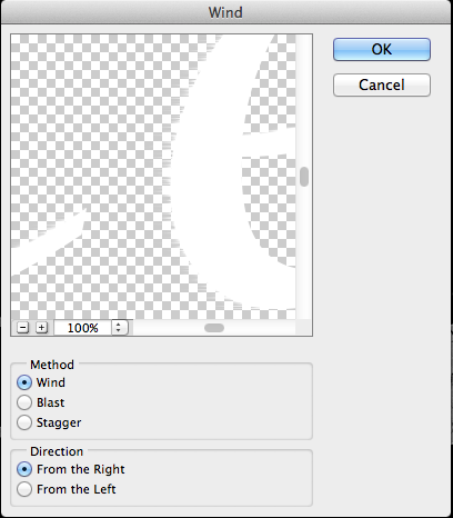
I did this effect in all four directions. Here is the final product:
This image however, appears as though it is sparkling and does not fit the genre of our film opening.


No comments:
Post a Comment